-
Iain Crawford
|
|
Iain Crawford grew up in Africa and Malaysia where he developed a passion for photography at an early age. He is based in London but he works internationally. He loves to capture images that have a strong graphic and textural quality. He has shoot campaigns for many of the world's top brands and also received commissions from a host of top international. On the paint shoot: ' I love the fusion between paint and model. The resulting shapes are as opulent as any piece of bespoke couture. The excitement and anticipation as we waited to see the next piece of unpredictable chaos was electric. There as something magical about how random chance materialised into beautiful images in front of our eyes' |
-
First unsuccessful experiment:
This was my first experimentation using paint which turned out to be unsuccessful as the background wasn't good enough plus I had to take the picture and throw the paint at the model. The weather wasn't good as well and my model was freezing so I couldn't take as many pictures due to keeping my model's health safe. If I carry out another experimentation, I would have to have a clear background and also few helpers who would be throwing the paint at the model so I can focus on just taking the pictures.
-
1st experiment using powder:
This was my first experiment using powder on the model. It was both successful and unsuccessful as I was happy with the colours I've used and how it went well with the model, but I could have used more powder and the lighting wasn't really good. However for a first experimentation I think it went well and I will be using the idea around powder through out.

|
Firstly, I played around with the brightness and contrast levels to manipulate the colours. Then I played around with hue/saturation to see how the colours could look different. Then I used the selective colour tool to enhance the colour of the powders even more. I used the dodge tool to lighten her eyeballs out to make them pop out a bit. I also used the burn tool around the background and her shoulder the take the attention away from it .
|
-
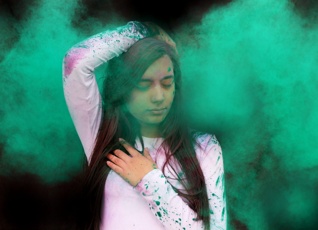
Second experiment:
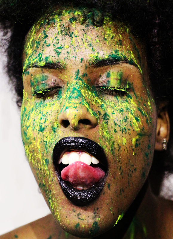
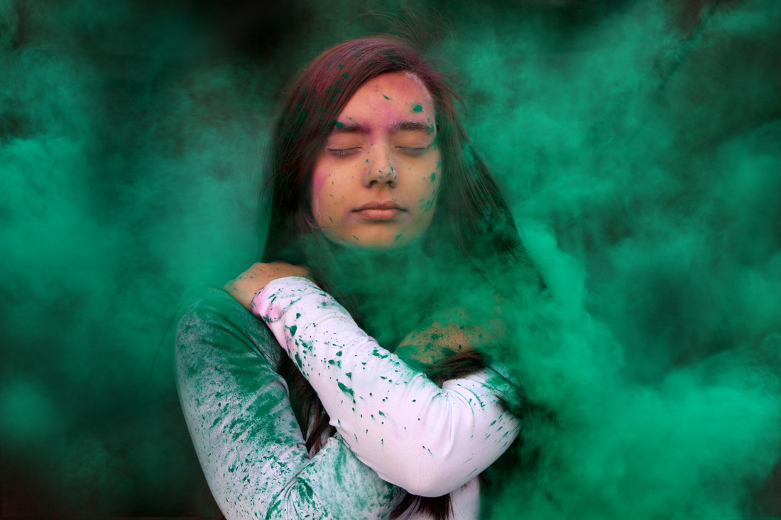
I carried out this experimentation at the same time as the previous experiment which is why they are very much similar to each other in the way of how I used the powder on the models. I decided to use green and yellow as I thought it would mesh well with my model's skin tone and used a black lipstick to tone everything together. This experimentation was successful as my model had experimented with various expressions and the lighting was better than the first experiment.
|
For this experimentation, I cropped out the excess shoulders first then played around with brightness and contrast a bit to enhances the colours. I used the selective colour tool to pop out the yellow more as it was over shadowed by the green. Then I sued the burn tool as well to see if it could manipulate the colours any more. I duplicated the layer then selected overlay at the opacity of 87% then the picture on the right is the outcome.
|
|
-
Third experiment:
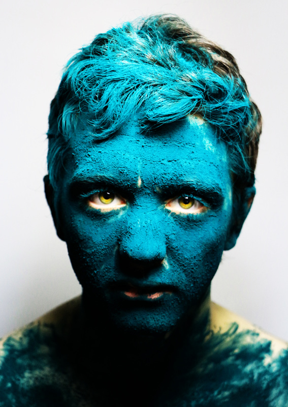
For my third experimentation , I used a male model instead of a female this time and I also poured the powder all over his face instead of sprinkling it. I wasn't happy with the shoot as I thought it looked very dull and basic. I also have used two different colours to show contrast on the model. The colour also did not come out as it was because of the lighting, the colour is much more darker which did not show in the shoot. Overall, this was unsuccessful experimentation.
|
Firstly I used the levels tool to pop out the green more as it looked darker than the picture. Then I used the hue/saturation tool which I played around with that manipulated the colour and came out as blue-ish, teal colour which didn't look bad at all. Then I used the dodge tool around the eye's of my mode to enhance even more. |
|
- Iain Crawford


Iain Crawford is the same photography who I was inspired by to carry out the paint experimentation shoot. His work on powder photography has inspired me to take a risk again and experiment with throwing powder this time instead of paint. His work shows the impact of the powder when it's thrown at the model which I aim to achieve for my my shoots. He has also used black background and vibrant coloured powder which grabs the views attention.
-
Photo shoot 1:
This was my first shoot on throwing powder on the model which I found both successful and unsuccessful. I found it successful as some of the pictures did come out the way I wanted it to but then I found it unsuccessful as the model kept flinching and the powder also came out in blocks instead of being smooth. I don't think that I chose a very vibrant and interesting colour which it didn't suit my model's skin tone. For my next shoot, I could with different methods of throwing paint which will allow my models not to flinch and also use a vibrant colour.
-
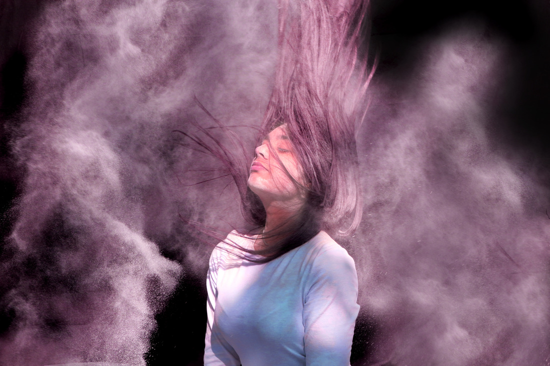
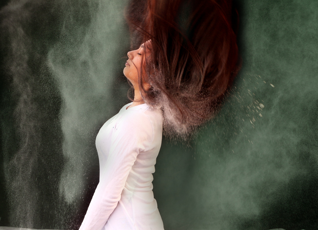
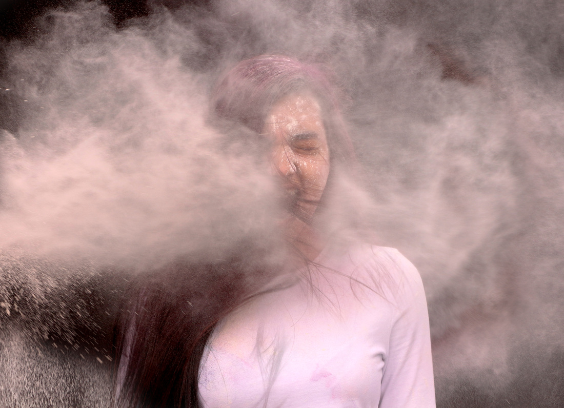
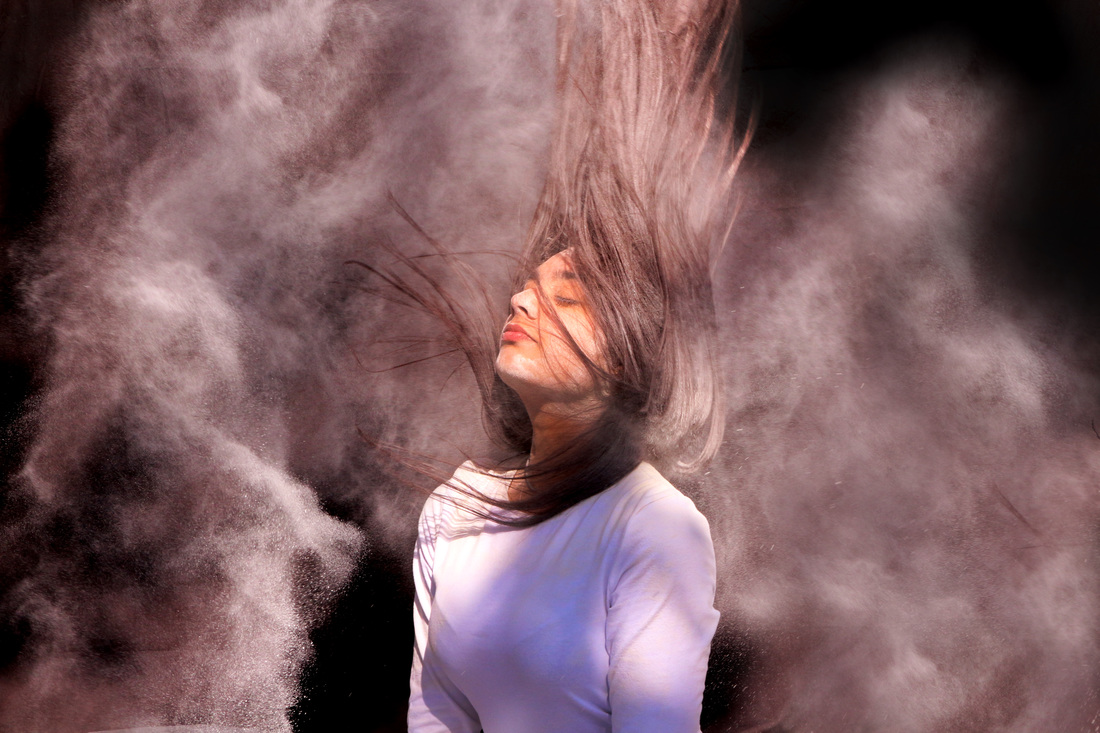
Photo shoot 2:
For this shoot, I experimented with a female model instead and instead of throwing powder at the model; I poured powder on her hair so when she flips her hair its shown. I chose to work with a black background as the white powder would be shown better and I chose to work with a white top as I didn't want the model to blend in with the background. I experimented with various hair flips and also with powder being thrown at the side when the model flips her hair so there's a lot of powder in the picture. I found this shoot every successful as I was happy with the outcome and will be using it towards my final work.
|
|
For this picture, I thought there wasn't that much powder which is why I chose another picture that had a lot of powder than placed it on top of the first picture. I then carefully erased the model of the second picture and put the powder. I played around with the levels tool to make the powder look more vibrant. I also play around with the brightness and contrast levels to enhance the picture. I used the blur tool to get rid of any creases on the black background sheet. Lastly I played around with the hue/saturation tool which is why the powders looks a bit yellow more than white. |
-
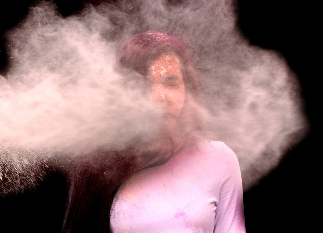
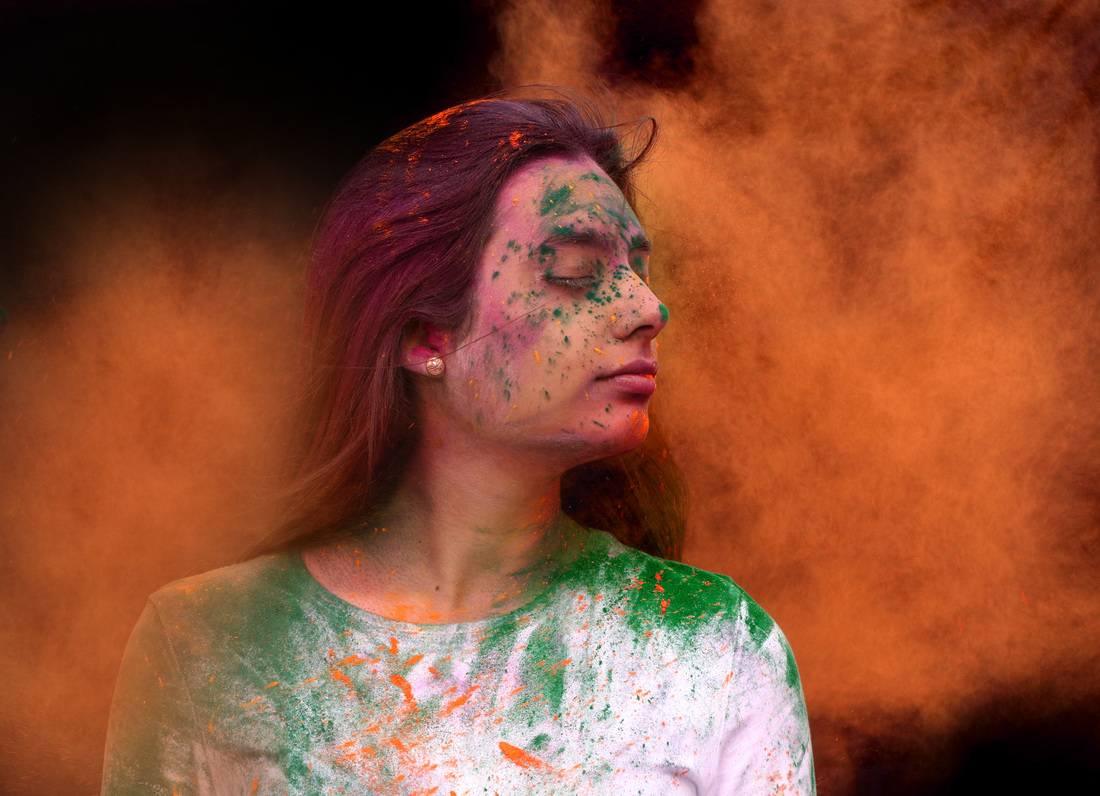
Photo shoot 3:
For my third shoot, I used the same model and the same background as well. This time round Instead of flipping her hair, she's getting powder thrown at with force. I used three different colours which were white, green and light orange. I experimented with variety of poses to see what looks better. For this shoot, I used white top again as I didn't want my model to blend in with the background if she wore a black top. I found this shoot very successful as the outcome were what I had planned.
|
I chose to work with this picture as it shows the impact of the powder when it's been thrown at the model. First I used the burned tool to make the creases darker. What I found difficult during this was that the more I darken the background it made the powder look fake and unattrative. I played around with the brightness and contrast level to see how the white powder could shown more. Then I used the levels tool to enhance the powder ever more so it's the main focus. What I could have done it clone the powder over the creases so the burn tool wouldn't make the powder look as fake and unattrative. The outcome of this experiment is below. |
|
|
|
I chose to work with this picture as I liked the way my model was posing and way the powder was all around her. So, firstly I played around with the brightness and contrast to make the powder gain more attention. Then I used the levels tool to enhance the powder even more as it made it darker than it was. I used the burn tool to darken the background since the creases were still visible in the picture. I dealt with the same problem here again as the more I try and hide the background, it makes the powder look a bit fake. The outcome of this experiment is shown below. |
-
Photo shoot 4:
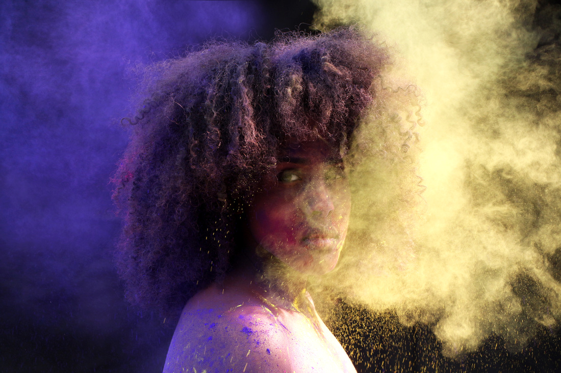
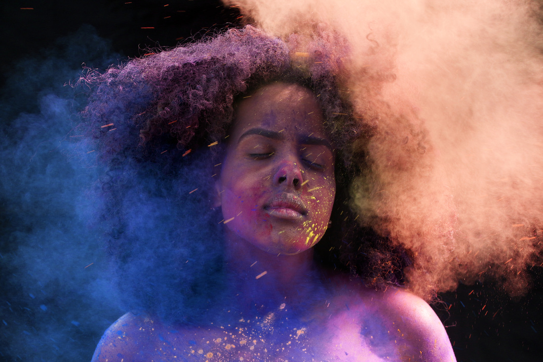
For my fourth shoot, I experimented with two different colours being thrown at the model. I chose complementary colours: yellow and purple. I also experimented only throwing purple powder at my model first then two different colours. What I found easier was that instead of throwing it at the model, blowing the powder towards the model was much more easier and quicker. I found this shoot successful as using two different colours was a excellent experiment which I wouldn't hesitate to try out again. I used a black background again as I found it much more easier to use than a white background.
|
|
|
-
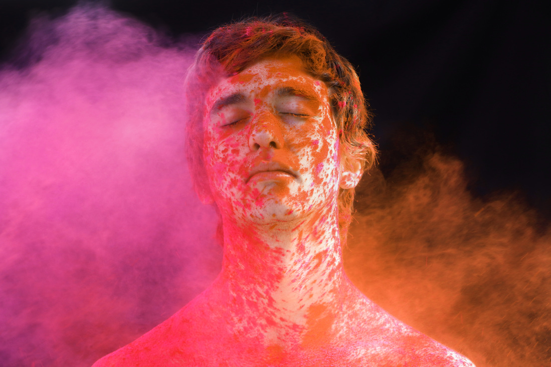
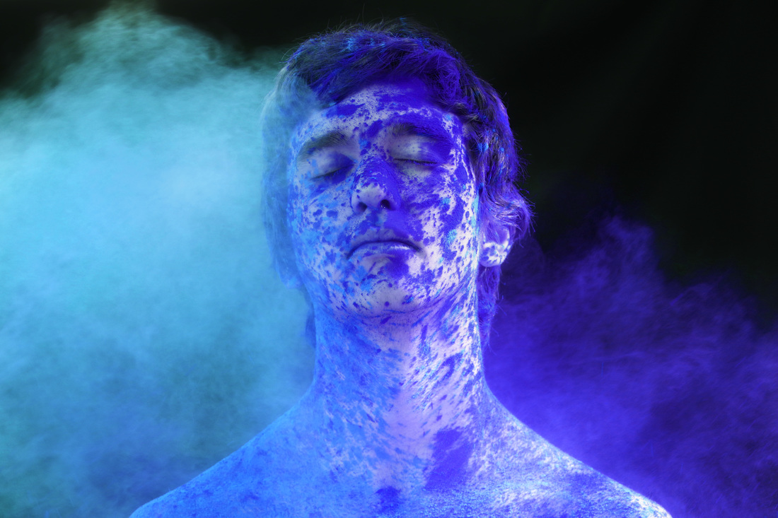
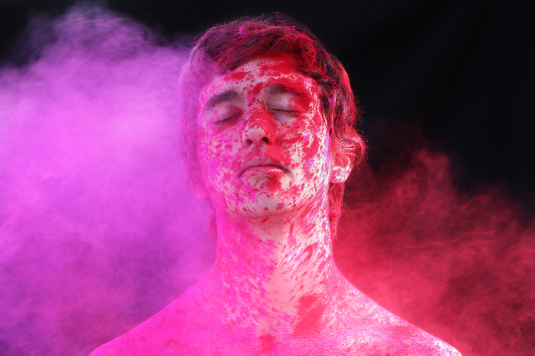
Photoshoot 5:
For my fifth and final shoot, I used a male model instead and two different coloured powder as well. I used pink and red as they the two colours that work well with each other. I kept the background black and it's much more easier for the colours to show in front of a black background. I also experimented with different poses as well. Overall, I found this shoot very successful and I was glad with the outcome of the shoot.
Working towards the mini outcome
For all my final pieces I have played around with brightness and contrast level to adjust the lighting. I used the burn too to get ride of the creases on the background. I've used the burn tool again to make the colours more vibrant and to grab the attention. I've played around with the levels tool to manipulate how to the colours would come out. I've used hue/saturation for some of my final pieces to manipulated the colour and changing it to a different colour. Also for some of my final pieces, I've placed another picture on top which made the picture have more powder than it normally did. I've used the clone tool to create fake powder as well which seemed to work quite well. Lastly I used the dodge tool to enhance the models' skin tone and the colour of the powder
|
|
|
|
|

|
|
|
|
|

|
|
|
|
|
AO4 Mini Outcome